Have you ever stopped to think about the learning curve you experienced when first using the maps app on your smartphone? Probably not, and there’s a good reason why — because there is no learning curve required.
The map app is among the most used, yet simplistic apps on your smartphone. Whether you’re one of the one billion+ people using Google Maps, or you’re a diehard Apple Maps fan, take a moment to appreciate the thousands of tiny decisions taken which make these apps so effortless to use.
No matter if you’re flying half way across the world, taking public transport or walking to the nearest cafe, maps help you effortlessly get from point A to point B.
Yet cartography, the art of map-making, is no simple task. Consider the near-infinite amount of data that can be displayed on a map, from continents to provinces to neighborhoods, forests to parks, rivers to creeks — how is it that a user can access what he/she needs quickly with without any training or a user manual.
Cartographers have seemingly perfected the art of informationproduct design. All the way back to the earliest civilizations an established set of simple principles have made maps intuitive.
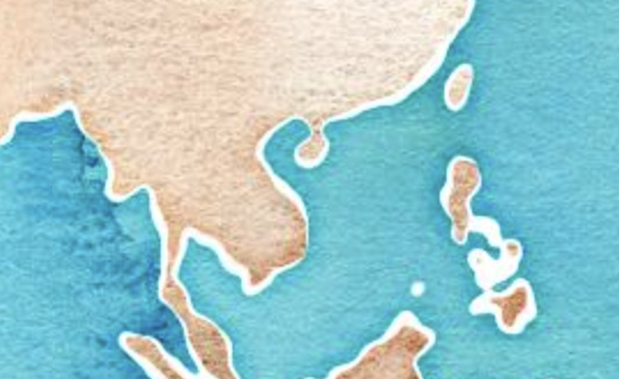
Without any explanation you instantly know what is land and what is water.
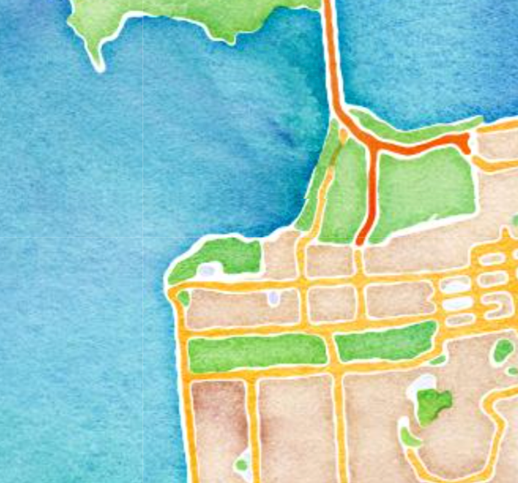
Green are parks or forests, orange lines roads with their thickness or shade denoting their size.
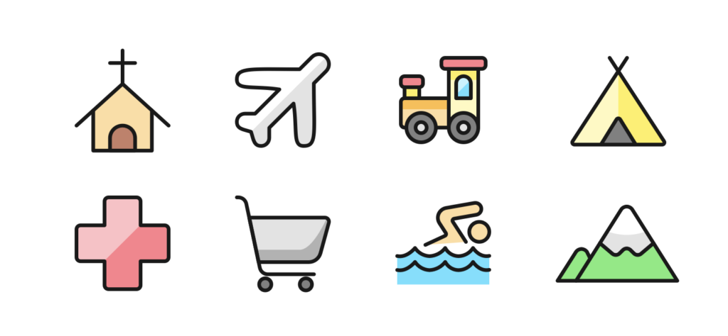
Symbols too easily understandable across languages and at a glance.
Cartographic Revolution
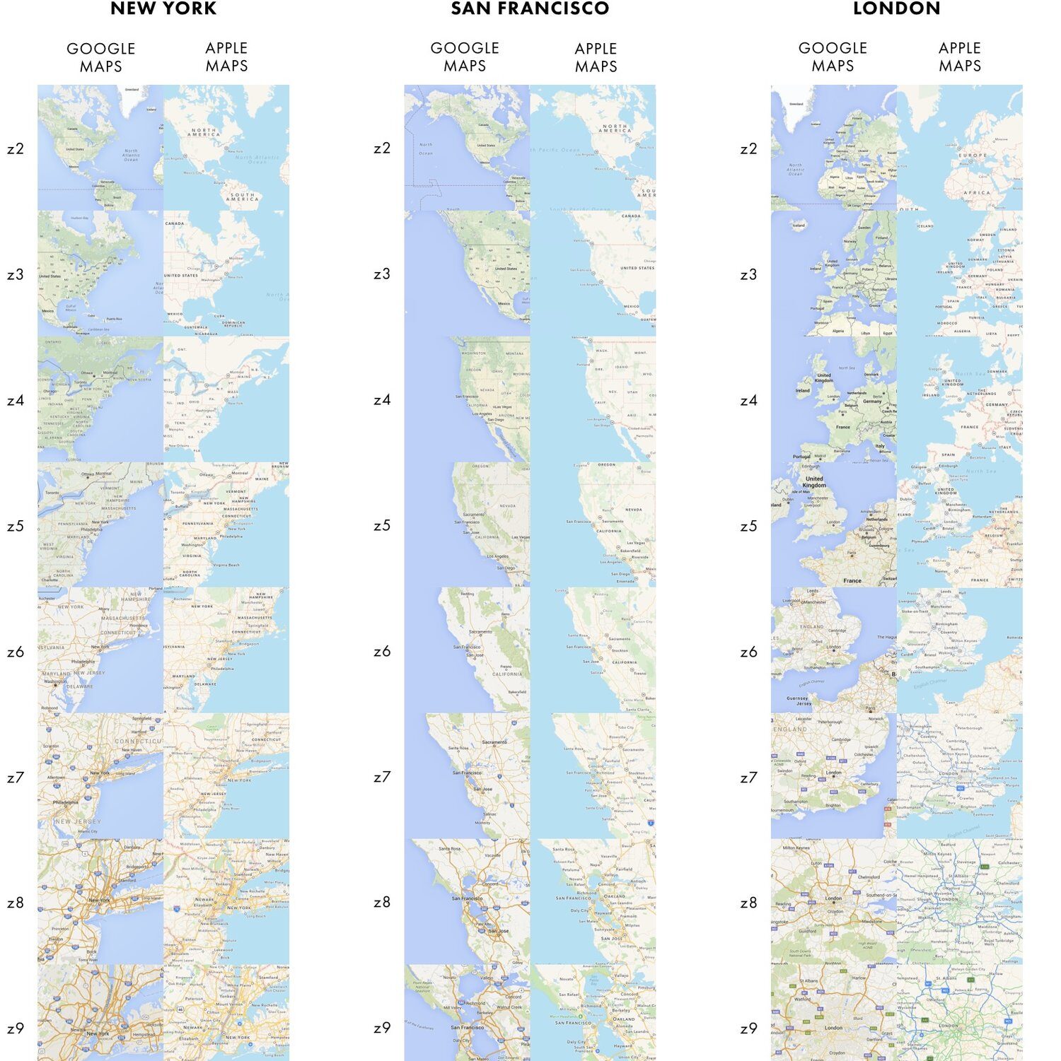
Being surrounded by maps for most of my life I took them and their well-established design principles for granted. The blog of Justin O’beirne (https://www.justinobeirne.com/) inspired me to see them in a new light.
The advent of the internet (Google Maps) and later, smart phones (mainly iPhone), completely transformed maps and the way they are created. Cartographers drawing each specific map by hand were been replaced by software designers making algorithmic decisions on what to show based on pinching to zoom in. Justin O’beirne’s posts comparing subtle differences between Google and Apple maps (https://www.justinobeirne.com/cartography-comparison) threw into sharp clarity the decisions made by these modern “cartographers”.
But here’s the kicker – while smartphones added more features and became more powerful, almost all map apps stayed beautifully simple. An interface without any help docs and all UI decisions made for the user.
Zero Customization
In a world where marketers obsess over customization and personalization, maps are a no-frills solution, eliminating the need to infer or make choices. With very few clues as to what we’re doing, maps aim to present us with exactly what we need and nothing that we don’t.
Zoom all the way out and you’ll see borders, country names and maybe capital cities.
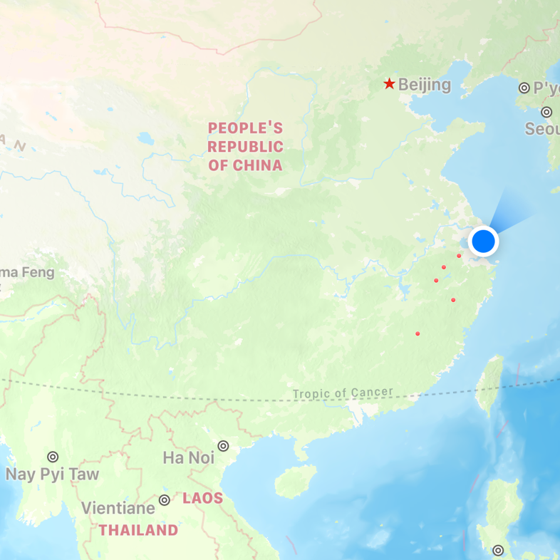
Pinch a step closer and we no longer need to be told which Country this is, but we do need to know what provinces, cities and major highways exist.
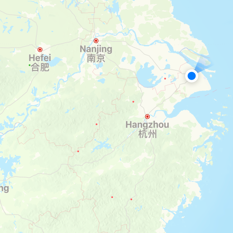
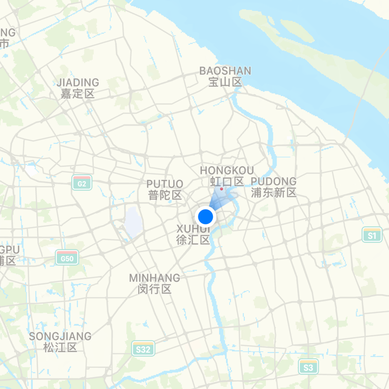
Another step and we see city districts, more roads and airports.
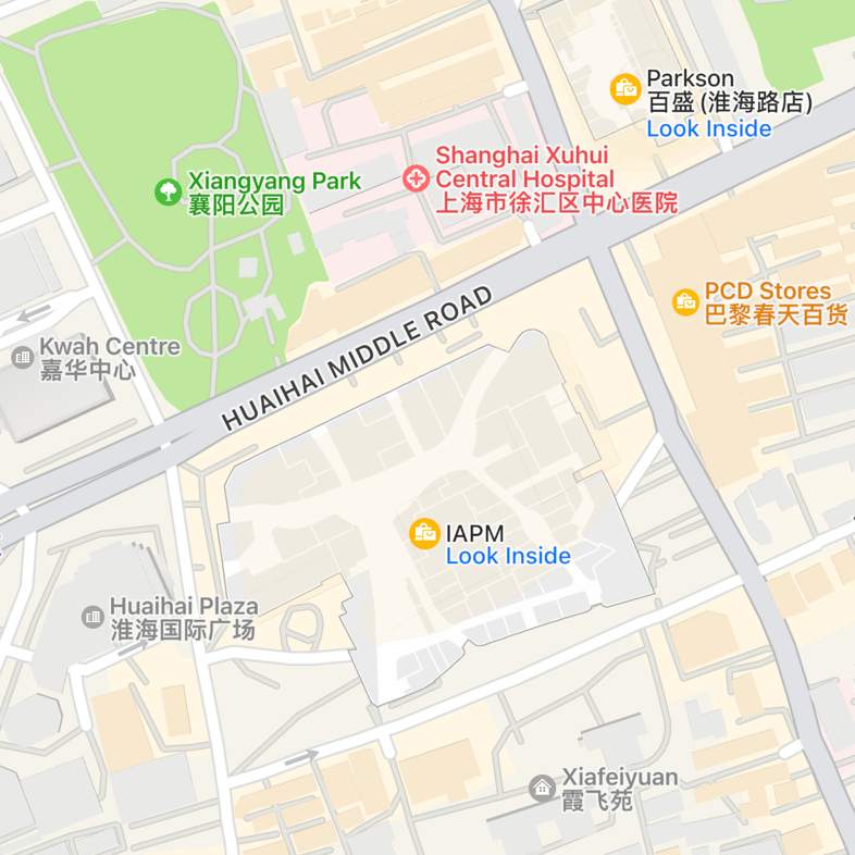
District names give way to parks, shopping areas and major attractions.
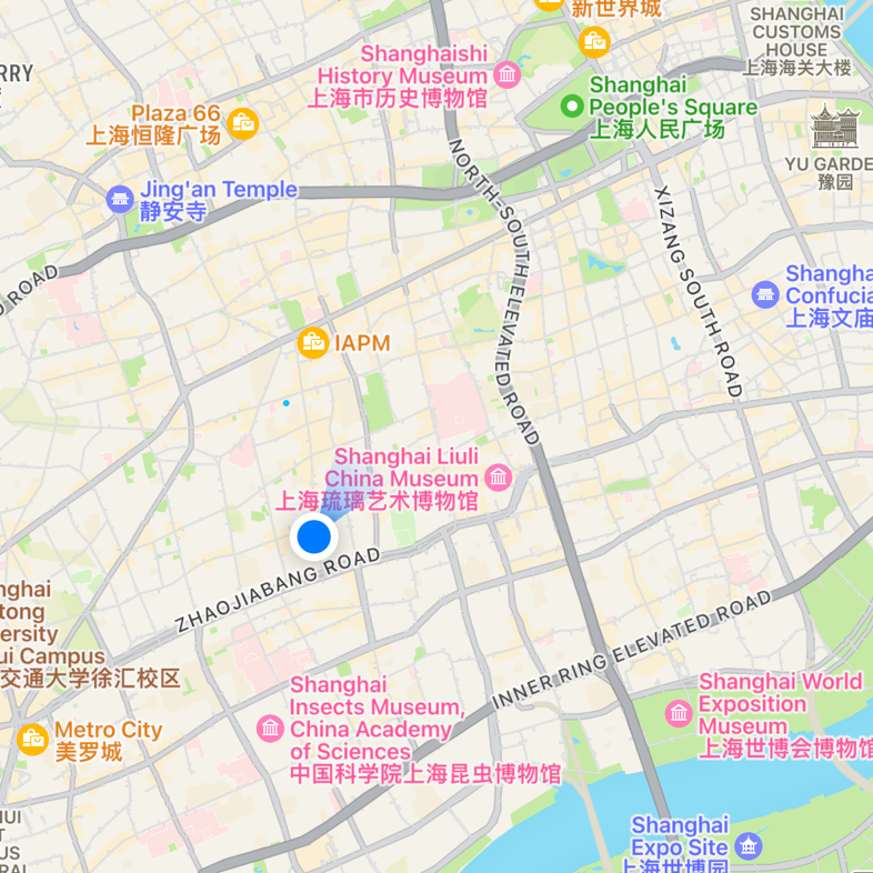
Finally, every building has an outline, every street a name and some buildings even let us look inside them.
All of these changes without us changing any settings or making any decisions.
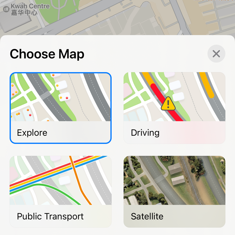
On Apple maps only 4 settings exist.
How We Applied These Principles to the Design of Analytics in KAWO
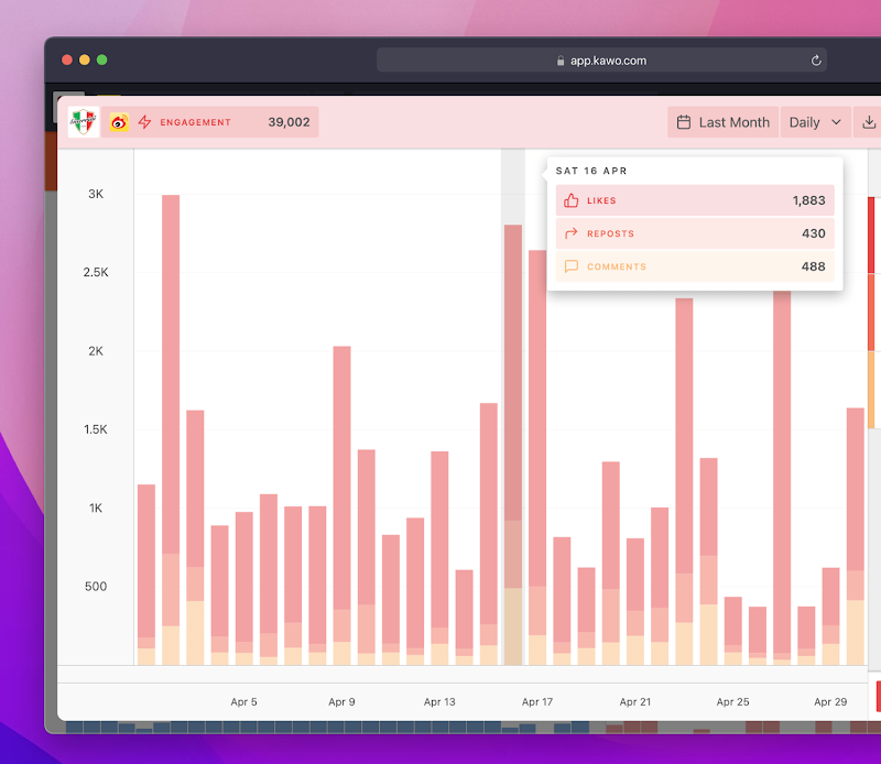
Data & reporting is one of the most demanded and scrutinized parts of our platform. Over the years we’ve added more networks, more metrics and more complexity.
In almost every user feedback session our customers tell us they want more settings and customization yet, when we’ve given users the options they asked for, they rarely use them.
Believe me I get it.
Our users just want KAWO to work. Our entire purpose is to make their lives easier and they don’t want to waste any time and energy configuring things. They’re busy, they just want to get in, get what they want and get on with their day. Similar to a map our users are trying to get somewhere and our role is (with very few clues) to help them.
So when we began the process of redesigning KAWO we looked not to our competitors for an approach, but instead to the art of cartography.
First, we established several principles…
Colors & Symbols
We assigned a color and standar icon to each metric. Just as blue on a map can immediately be understood as representing a body of water, a regular KAWO user will automatically associate red with engagement and blue with impressions.
Hiding Things
When a user lands on the KAWO dashboard, they just see icons and top level numbers shortened to save space. This is the Country-level view. Think of a manager or a CEO who doesn’t need to get into the nitty gritty, nor does she/he have the time, big-picture information like, ‘are we meeting our KPIs?’, ‘is traffic trending up or down?’ can be quickly realized.
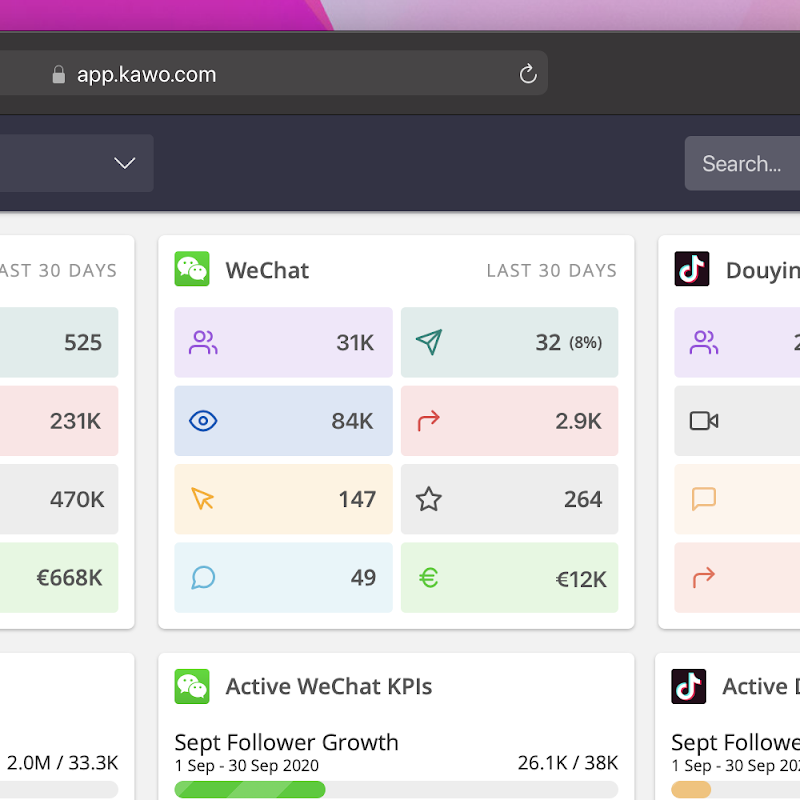
Zoom in a level and the other networks are gone, but labels have appeared, numbers are exact and additional sub-metrics show up. The user can now dive deeper into a specific platform to explore performance, content trends and more.
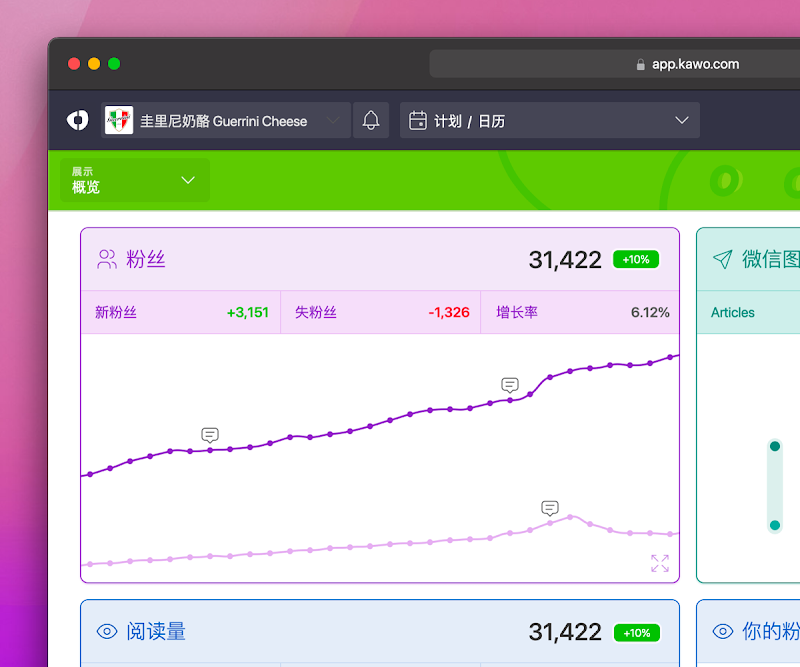
Step into each tile and a new, more minute layer of metrics appear and more details become available. These are the backroads, the alleyways, the arteries that hold the keys to a brand’s success on social media.
For this approach to work we had to make a few assumptions:
1) How Well We Understand User Needs
Is a shortened number with a K accurate enough? Should Comments, Likes & Shares be aggregated into engagement?
2) Willingness to Explore
By hiding information there is a danger the user won’t find it and might assume it doesn’t exist in KAWO. With maps predominantly used on mobile, pinching to zoom is very well established, but with KAWO used 94% on desktop our UI pattern requires users to click to change what they’re seeing.
3) Familiarity
We’re a subscription software business and so we hope our users will log in weekly or monthly if not daily in some cases. If this isn’t the case then there is little benefit to creating and re-using standard colors which exist only inside KAWO.
The re-evaluation of these assumptions and continuous trainings and customer feedback sessions are what keeps our product team busy.
Inspiration from Unlikely Sources
It would have been easy to look to our competitors while designing KAWO — after all, social media management platforms used in Western markets have been around for years, while in China the SaaS industry as a whole is just beginning — but when we look at our competitors are we constraining our thinking to existing ideas? Does looking at WHAT our competitors do explain WHY they do it? And is that WHY going to be the same for our users?
I hope this post has inspired you to appreciate seek inspiration from beyond your front doorstep, if nothing else, you’ve been given an inside peek at how we designed, if I may be so bold, a pretty darn good product.


