Cover Image is the most attention grabbing part of your WeChat post. The harsh reality is that more than 70% of OA have less than 30% of users who read its articles frequently. To boost your post open rate and even convert more loyal users, more care needs to be taken when selecting your cover images. KAWO finds that there are four key points successful WeChat cover images share:
In this article, we will explain each of the point above with demonstrations of good and/or bad examples. Read through and select your next cover image with confidence.
Color Tone
The average open rate for WeChat articles is lower than 2%, which means the competition for attention has never been more intense. To make your article stand out when your users are scrolling through their subscription lists, first and foremost, choosing a right color tone.
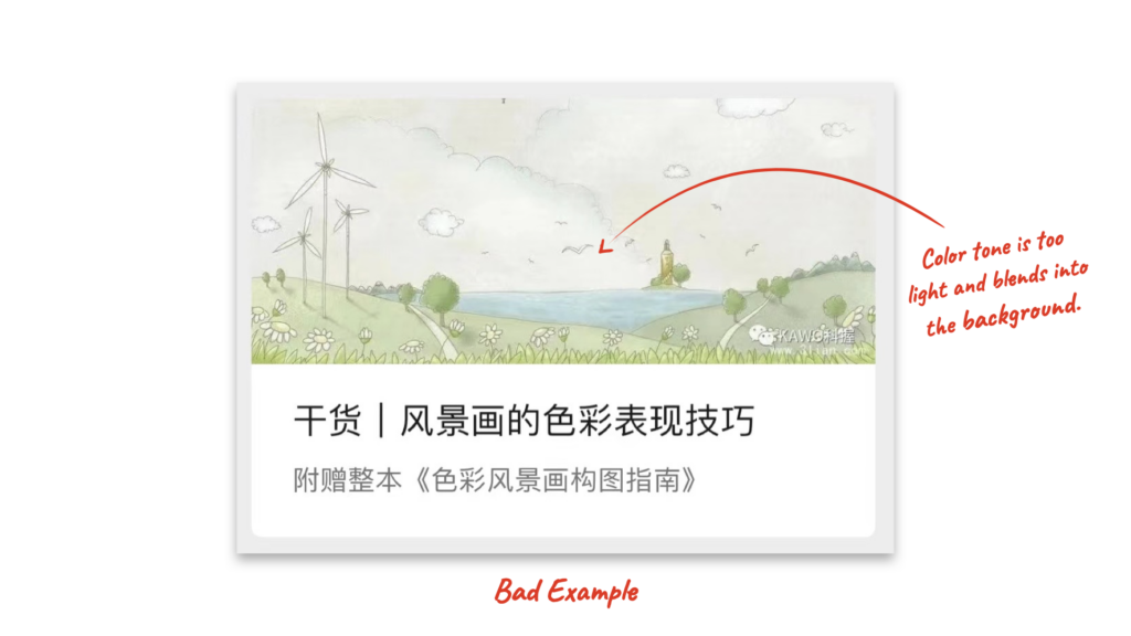
There is no point picking a dim or dull color for your WeChat cover image unless it’s your OA’s style and it attracts a specific type of readers. For most readers, it is not the best way to retain their attention.
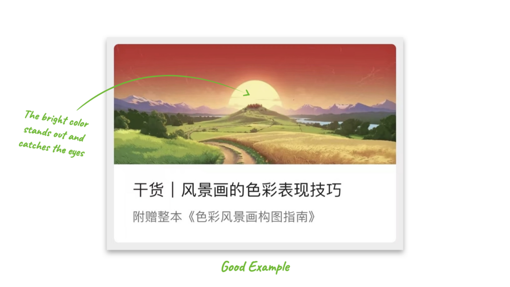
It’s more likely to grab users’ attention with a bright color tone as they scroll through the articles, which makes it more likely for them to notice the title and even click your article.
Relatability
Cover images should reinforce and expand on your content topic empathetically. Let’s take a look at the post for the flash sale of Haitan Islands Honeymoon package.
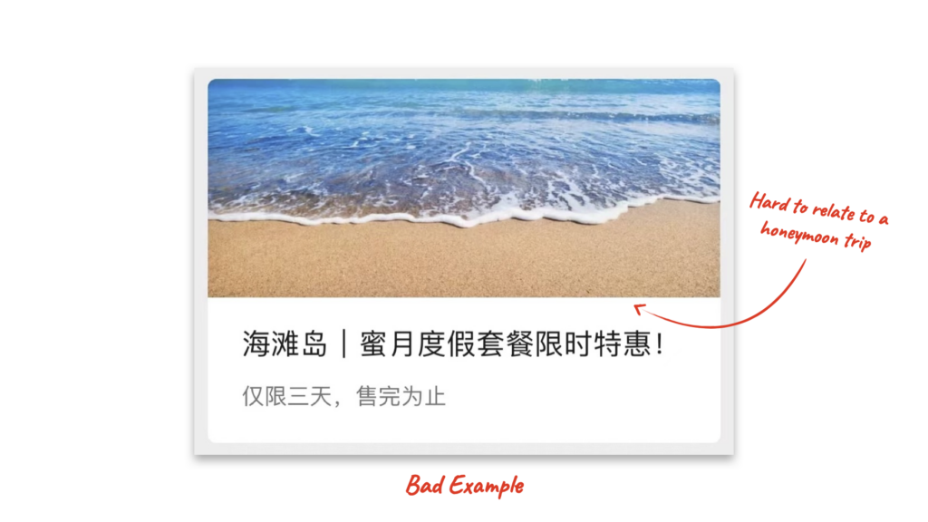
It’s hard for your readers to relate this tedious beach photo to a fun honeymoon trip …
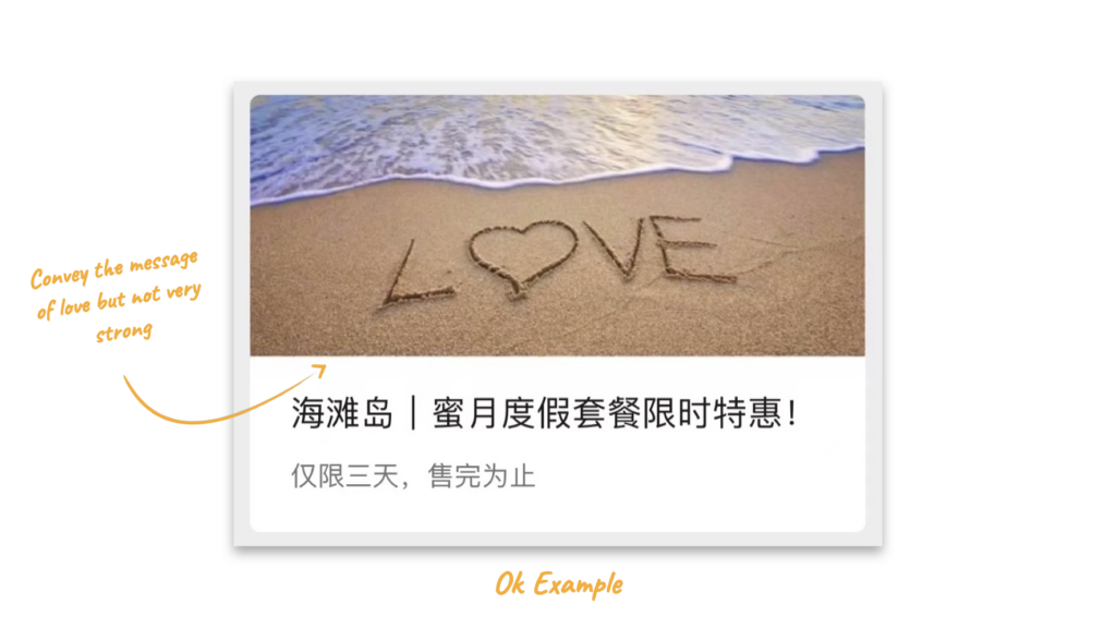
Writing the word ‘Love’ on the sand and including them in the pic is definitely straight forward when it comes to expressing the theme , but it’s still lacking some human touches, missing a sense of resonance.
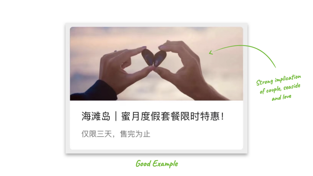
Now his image has a strong implication of couple, seaside and love, which readers are most likely to feel empathetic with. A good cover image should do just that: forecast on your content and impress your users with subtle messages.
Focal Point
Your picture should have a focal point, that effortlessly attracts the eyes. For this post of Christmas theme, we cropped two different parts of the same picture to demonstrate a focal point.
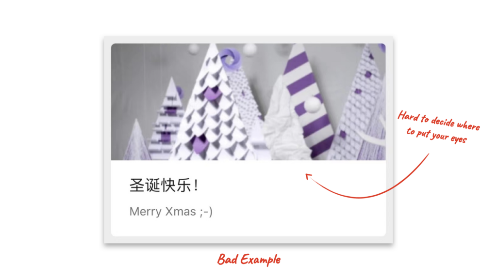
It’s hard to decide where to put your eyes. Remember, your user will not spend a long time staring at the image and figure out that these triangles are meant to represent pine trees.
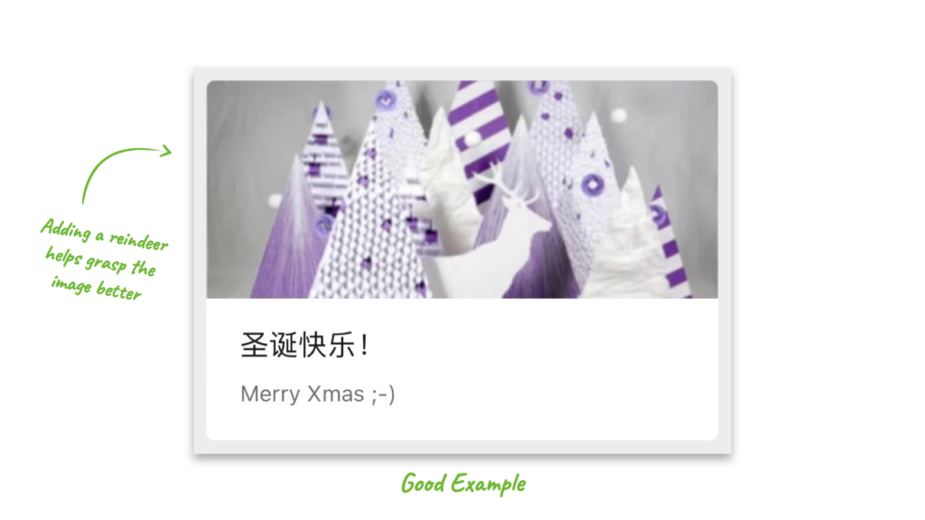
Same picture, but we include a reindeer to catch your eyes 😉 Because users will look at your cover images for only for a short, few seconds, a single focal point will help them grasp the image better.
Readability
Last and most importantly, make sure that your readers will be able to see both the title and the cover image clearly. Unfortunately, the WeChat visual design brings two major challenges to readability. Let’s see two bad examples:
Title Readability
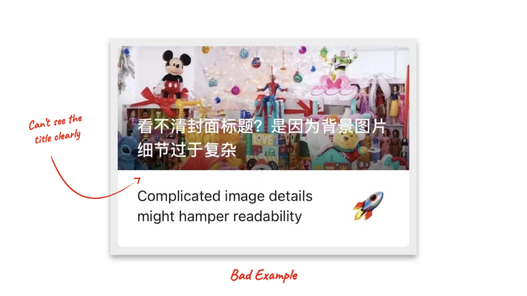
When you push two or more articles in one post, WeChat overlays the title of the first article onto its cover image. Since there is no shadow behind the title, your readers will probably have a hard time reading the title if your cover image is made with colorful or complicated details, or simply has a light color.
Image Visibility
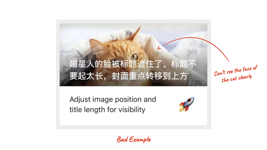
When your title is long (more than 13 Chinese characters), it starts to block too much image space. To keep the key visual information in the image (case in point, face of the cat) visible, it’s wise to preview your cover image and adjust accordingly everytime before posting.
What’s the easy solution?
In KAWO backend, you can adjust and crop the image into the right size and preview your cover image as exactly how it will look in different article . We provide previews of different title lengths inside a multi-article post, so you don’t have to worry that the cover image will be covered by the long title.
it can also show you what the cropped image looks like in article history, article search and shared article, as illustrated in the left column of the video.
Hope this article helps you understand the WeChat cover image better. Drop us a message if you have any thoughts or questions!


