Visualizing data in your reports can assist you in understanding and identifying trends. Here are some ways KAWO visualizes data to assist in analyzing content trend on social media platforms: Line, Column, Pie, Table, Number, Top Content, and Word Cloud.
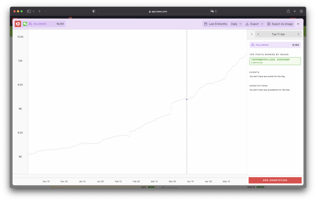
Line
The growth of your followers is displayed as a line for the selected time period, with granularity options of Daily, Weekly, and Monthly. It’s a great way to analyze data over time.
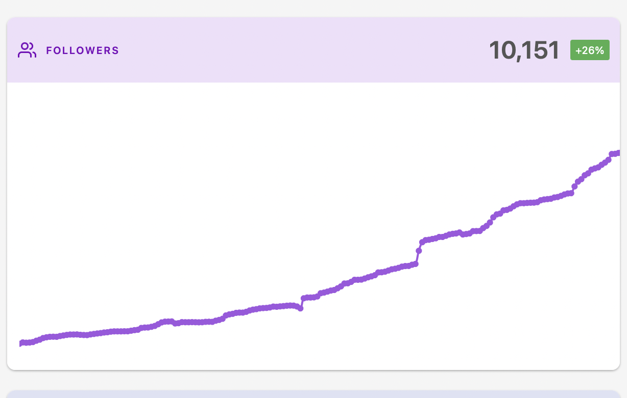
Tip: Select any points on the line, and take a closer look into the content that contributes to growth in followers. Use Column (see below) to view the Follower Gain/Loss metric.
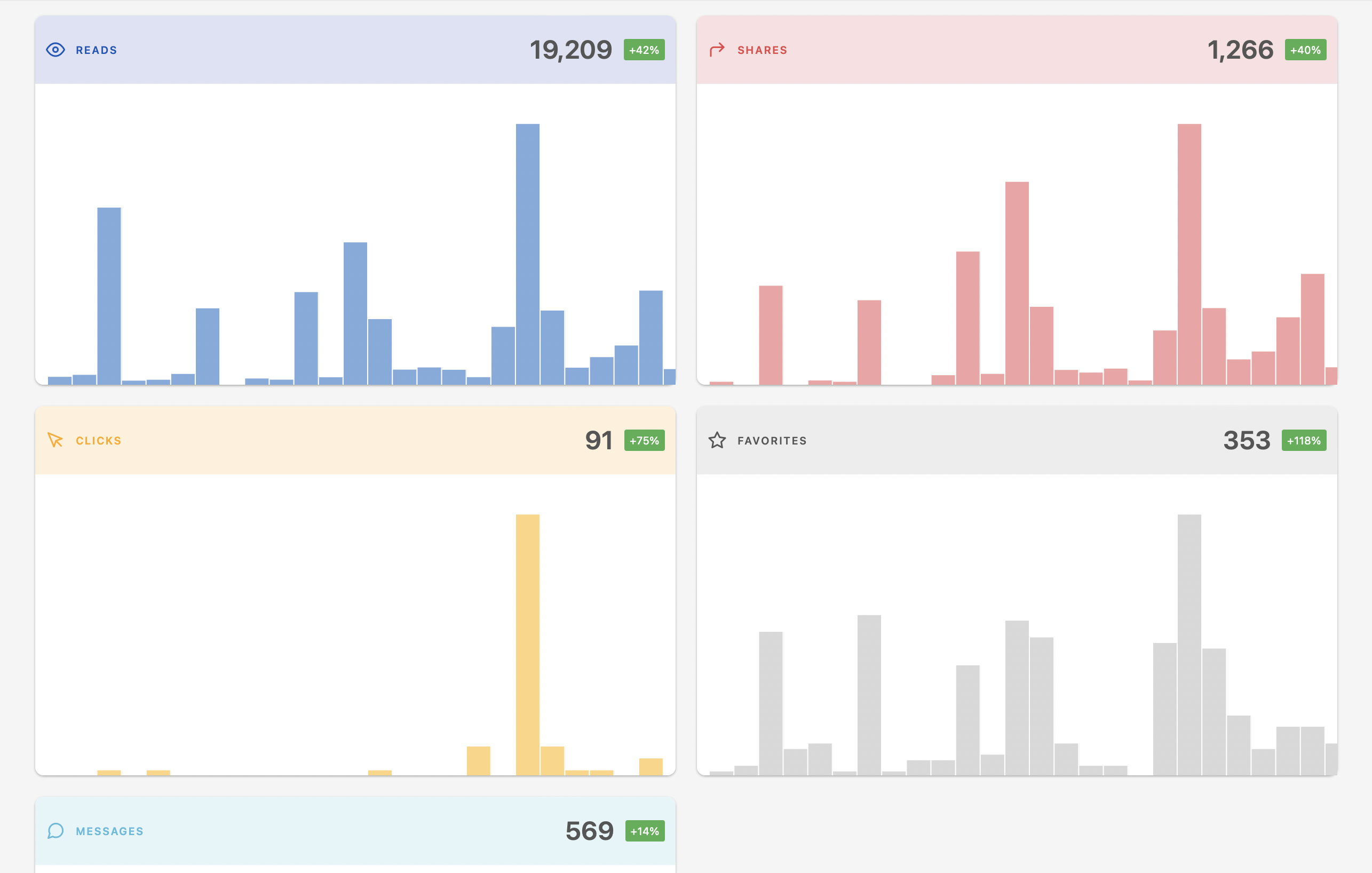
Column
Your Follower Gain/Loss metric is displayed for the selected time period with each vertical column representing a day, a week or a month.
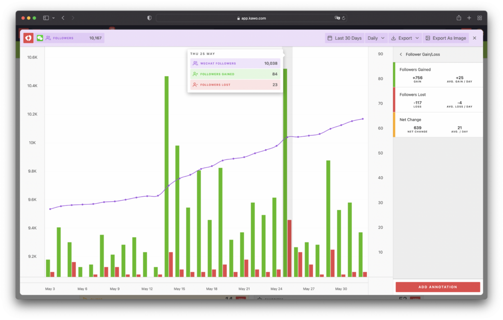
Tip: A number of account-wide metrics are available, such as Reads, Shares, Clicks, and Favorites, and the visualized data can be exported as images and spreadsheets.
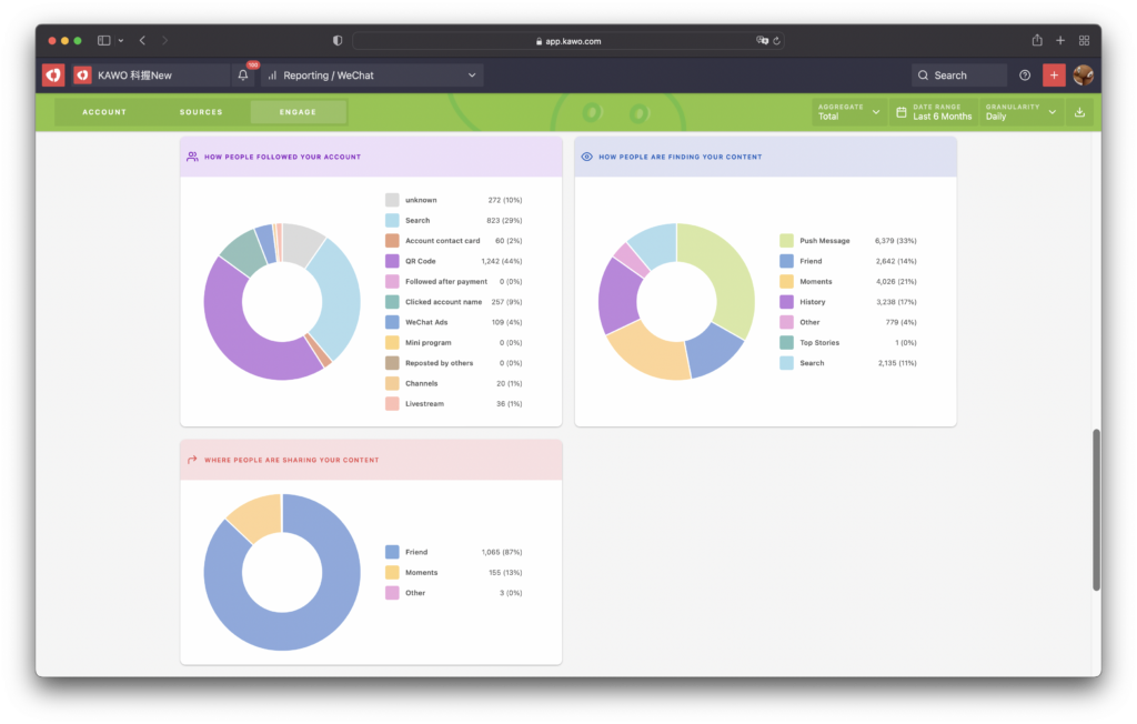
Pie
The Pie charts in KAWO Reporting display a variety of data sources such as HOW PEOPLE FOLLOWED YOUR ACCOUNT, HOW PEOPLE ARE FINDING YOUR ACCOUNT, and WHERE PEOPLE ARE SHARING YOUR CONTENT.
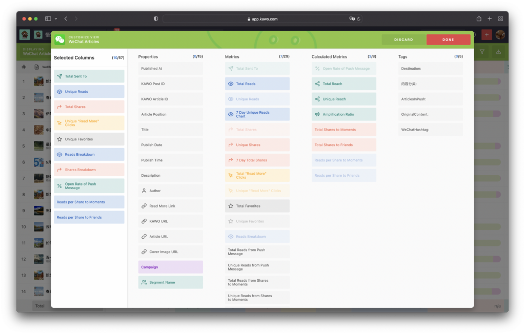
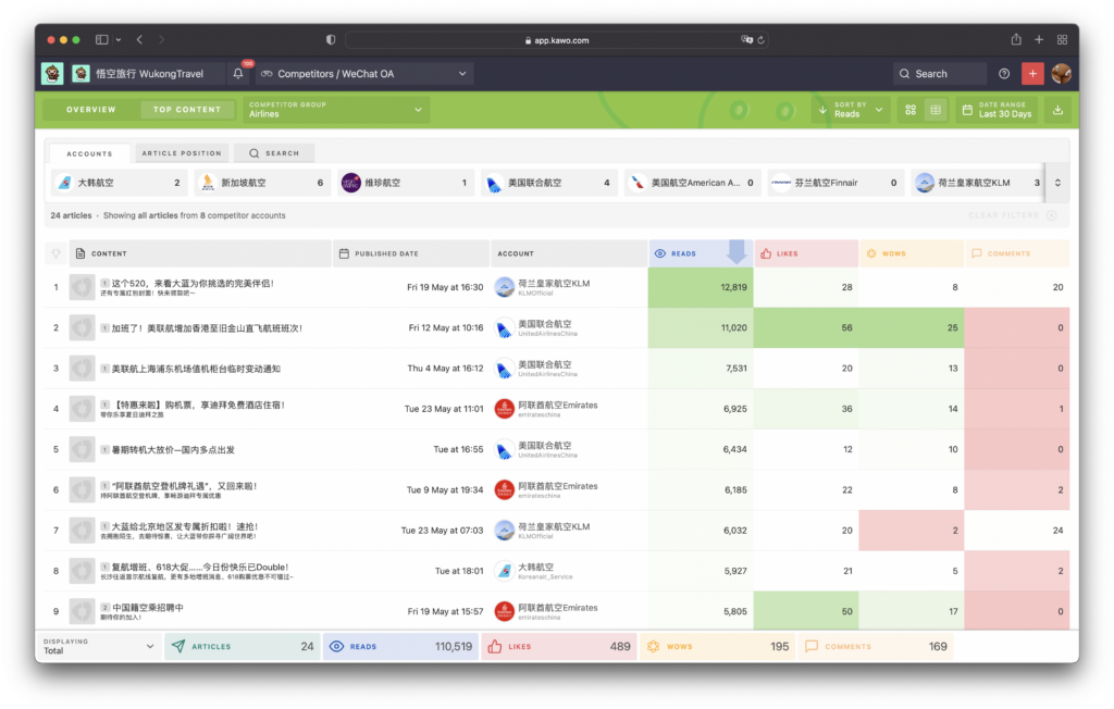
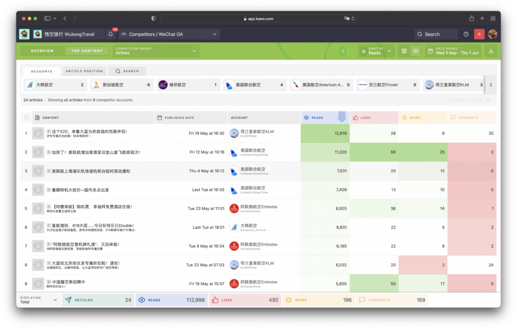
Table
You can view your WeChat, Weibo, Kuaishou, and Douyin post stats in Data Center
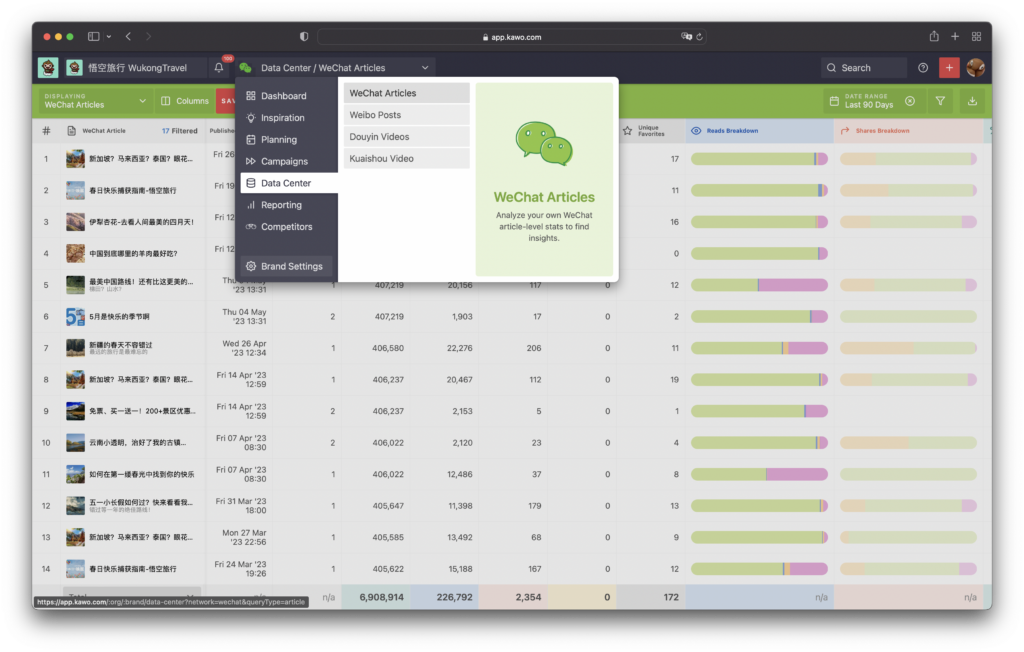
Tip: The table can be customized by selecting the metrics you need, and it can also be saved or reset.
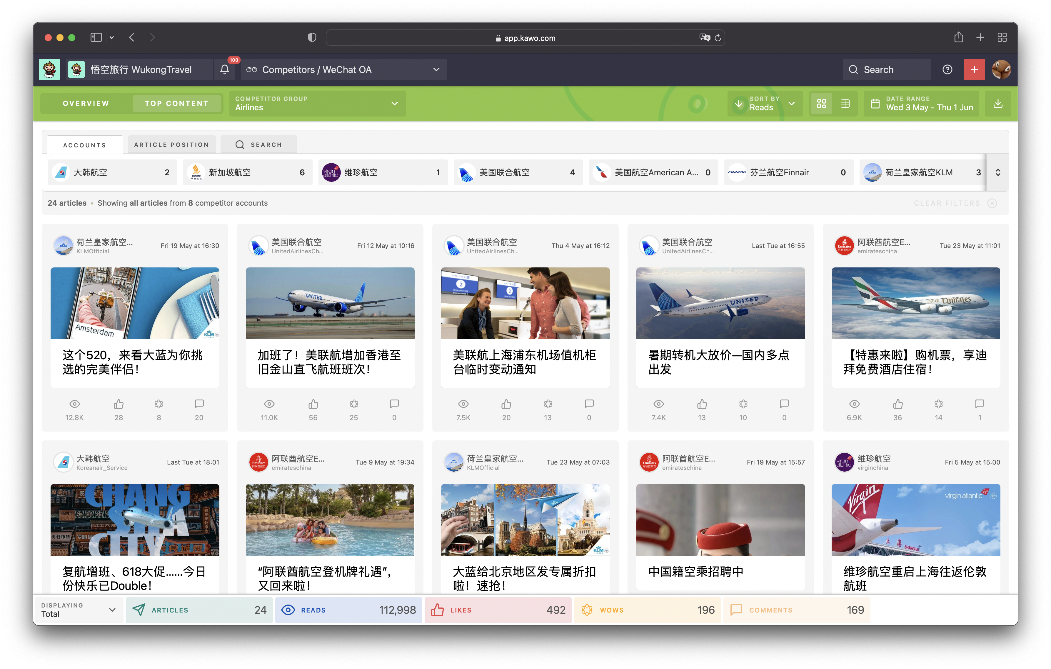
The Top Content (see below) in Competitors displays your competitors’ top content in Table and Grid.
Number
KAWO Dashboard displays each metric with the aggregated numeric value of your last 30-day stats.
Top Content
In KAWO’s Competitors, brands can easily search for their competitors’ top content or any content with specific keywords in order to analyze their competitor’s efforts on seven mainstream social media platforms in China.
Users can toggle between Table and Grid for information displayed in the Top Content; the data can be exported as spreadsheets.
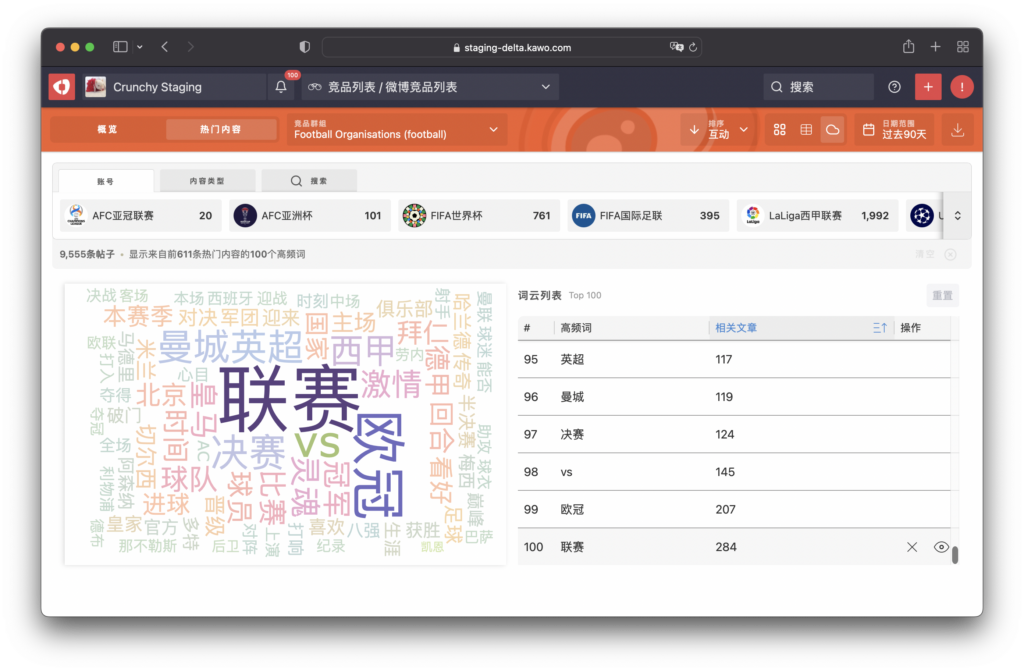
Word Cloud
The Word Cloud feature in KAWO’s Competitors offers a visual representation of the most common keywords used in your competitors’ top posts. This helps you to quickly understand the main themes or topics of your competitors’ posts.